· react · 14 min read
Build your own shimmer skeleton that never goes out of sync
Skeleton screens break every time you touch the UI. Here's how to build one that reads the DOM and keeps itself in sync automatically.

Neciu Dan
Hi there, it's Dan, a technical co-founder of an ed-tech startup, host of Señors at Scale - a podcast for Senior Engineers, Organizer of ReactJS Barcelona meetup, international speaker and Staff Software Engineer, I'm here to share insights on combining
technology and education to solve real problems.
I write about startup challenges, tech innovations, and the Frontend Development.
Subscribe to join me on this journey of transforming education through technology. Want to discuss
Tech, Frontend or Startup life? Let's connect.

Table of Contents
- The maintenance trap
- What existing libraries do (and don’t do)
- Step 1: The dumbest possible version
- Step 2: Measure the DOM
- Step 3: Steal the border radius
- Step 4: The shimmer animation
- From static HTML to a real app
- Step 5: Wire it up with useLayoutEffect
- Step 6: Handle edge cases
- Designing mock data
- The tradeoffs
- References
If you haven’t worked with skeleton screens before, they’re the grey placeholder shapes you see while content is loading.
Open LinkedIn or Facebook on a slow connection, and you’ll see them: grey rectangles where text will be, grey circles where avatars will be, all pulsing with a shimmer animation.
They feel better than spinners because the page doesn’t look empty while you wait. The user gets a sense of where things will appear before they actually do.
The problem is how they’re built.
Most teams create a separate skeleton component for every real component, a UserCardSkeleton for every UserCard, a TransactionListSkeleton for every TransactionList.
Each skeleton is a hand-crafted approximation of the real layout, with hardcoded widths, hardcoded heights, and hardcoded border radii.
The maintenance trap
Here’s what a typical skeleton looks like:
function UserCardSkeleton() {
  return (
    <div className="card">
      <div className="skeleton-circle" style={{ width: 48, height: 48 }} />
      <div className="skeleton-line" style={{ width: '60%', height: 16 }} />
      <div className="skeleton-line" style={{ width: '40%', height: 14 }} />
    </div>
  );
}
And here’s the real component:
function UserCard({ user }) {
  return (
    <div className="card">
      <img src={user.avatar} className="avatar" />
      <h2>{user.name}</h2>
      <p>{user.role}</p>
    </div>
  );
}
Two components for the same layout, manually synchronized. Change anything in UserCard and the skeleton implementation will remain behind if you are not careful.
What existing libraries do (and don’t do)
react-loading-skeleton gives you a <Skeleton /> component with configurable width, height, and border radius.
It handles the shimmer animation and the pulsing gradient.
The DX (Developer Experience) is much nicer than rolling your own CSS.
<Skeleton circle width={48} height={48} />
<Skeleton width="60%" height={16} />
<Skeleton width="40%" height={14} />
But you’re still hardcoding dimensions.
You’re still guessing at widths with percentages, and you’ll still forget to update this when you add a badge to the card six months from now.
react-content-loader takes a different approach.
You draw SVG shapes that look like your skeleton. The SVGs look great, much more polished than stacked rectangles.
But an SVG that looks like a card is not derived from the card. It’s a drawing of the card. Changing the card’s layout makes the SVG wrong.
Both libraries make the animation easy. Neither one keeps the skeleton in sync with the component it represents.
I kept thinking about this.
Instead of describing what the skeleton should look like, why not just measure the real component and draw shimmer blocks on top? Skip the second component entirely. The real component, rendered with fake data, IS the skeleton.
I found a library that does exactly this.
The library shimmer-from-structure is a nice implementation of exactly what we want, and the implementation is short enough that we can build it from scratch right here.
Step 1: The dumbest possible version
Let’s start simple. We will render a component, hide its text with color: transparent, and overlay a single shimmer animation on the whole thing.
<div style="position: relative;">
  <!-- Real component, text hidden -->
  <div class="card" style="color: transparent;">
    <img src="placeholder.jpg" class="avatar" />
    <h2>John Doe</h2>
    <p>Software Engineer</p>
  </div>

  <!-- Full-card shimmer overlay -->
  <div class="shimmer-overlay"></div>
</div>
This already does something useful: the card’s padding, margin, and background all render correctly because we’re using the actual component. The shimmer overlay just sits on top.
Notice we’re using color: transparent and not opacity: 0 or visibility: hidden.
opacity: 0 kills everything, including the card’s background, border, and shadow.
The shimmer would float over nothing.
visibility: hidden keeps the space but also hides backgrounds.
color: transparent only hides the text. The card’s container styling, background, border, and shadow all render normally.
We also want pointer-events: none on the hidden content so users can’t accidentally click invisible buttons or select invisible text during loading.
But it looks terrible. One big shimmering rectangle covering the entire card. Check it out:
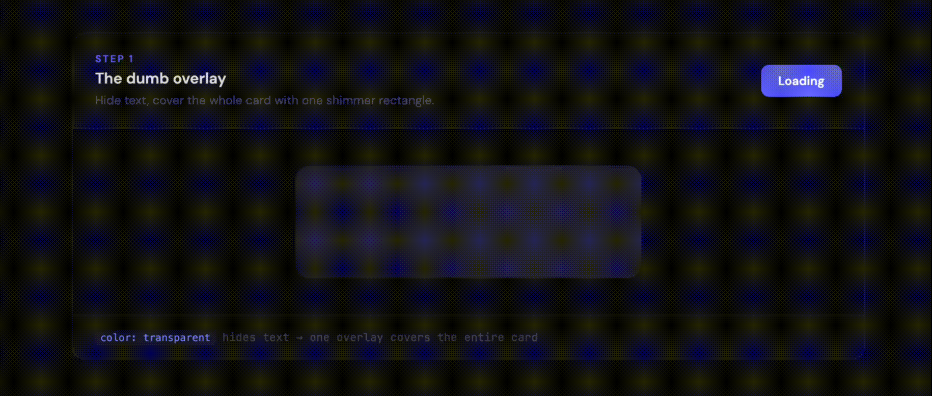
Real skeleton screens include individual blocks for the avatar, name, and role. Each element gets its own shimmer.
Step 2: Measure the DOM
The browser already knows where every element is. getBoundingClientRect() gives you the exact pixel position and size of any DOM node. So instead of guessing what the skeleton should look like, we can ask the browser.
function measureLeafElements(container) {
  const elements = container.querySelectorAll('img, h1, h2, h3, h4, h5, h6, p, span, button, a');
  const containerRect = container.getBoundingClientRect();

  return Array.from(elements).map(el => {
    const rect = el.getBoundingClientRect();
    return {
      top: rect.top - containerRect.top,
      left: rect.left - containerRect.left,
      width: rect.width,
      height: rect.height,
    };
  });
}
We query for “leaf” elements, the ones that actually contain visible content: images, headings, paragraphs, buttons.
We skip container <div>s because they’re structural, not visual.
A <div className="card"> wrapper doesn’t produce a visible rectangle the user perceives as content; the <h2> inside it does.
If we selected every element with *, we’d get shimmer blocks for every wrapper div, every flex container, every layout element, and the result would be a mess of overlapping rectangles.
The subtraction from containerRect is important. getBoundingClientRect() returns positions relative to the browser viewport, like “432 pixels from the top of the screen.”
But our shimmer blocks use position: absolute, which positions them relative to their parent container rather than the viewport. Without subtracting the container’s position, every shimmer block would be offset by the distance between the container and the top-left corner of the page.
This gives us an array of rectangles, one per visible element, with their exact positions and sizes within the container. Now we can render individual shimmer blocks instead of one big overlay.
function ShimmerBlocks({ measurements }) {
  return measurements.map((rect, i) => (
    <div
      key={i}
      className="shimmer-block"
      style={{
        position: 'absolute',
        top: rect.top,
        left: rect.left,
        width: rect.width,
        height: rect.height,
      }}
    />
  ));
}
Check out how it looks like:
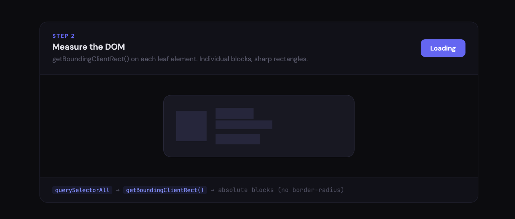
Already a massive improvement. Each element gets its own shimmer block, positioned exactly where the real element lives. Change the padding, move elements around, add a new element, and the shimmer follows because it’s computed from the actual layout.
We went from maintaining a separate component to running three lines of DOM measurement code.
But the blocks are all sharp rectangles, even though the avatar is a circle and text elements have rounded corners in real UIs. It looks too robotic.
Step 3: Steal the border radius
The browser also knows the computed border-radius of every element. getComputedStyle() gives us access to the final, resolved CSS values. Here’s the updated measureLeafElements with border-radius detection added:
function measureLeafElements(container) {
  const elements = container.querySelectorAll('img, h1, h2, h3, h4, h5, h6, p, span, button, a');
  const containerRect = container.getBoundingClientRect();

  return Array.from(elements).map(el => {
    const rect = el.getBoundingClientRect();
    const computed = getComputedStyle(el);
    const borderRadius = parseFloat(computed.borderRadius) || 0;

    return {
      top: rect.top - containerRect.top,
      left: rect.left - containerRect.left,
      width: rect.width,
      height: rect.height,
      borderRadius,
    };
  });
}
Circular avatars get circular shimmer blocks, and rounded buttons get rounded ones.
One small detail: text elements like <p> and <h2> almost always have border-radius: 0 in CSS, but sharp rectangular shimmer blocks for text look harsh. A subtle fallback radius of 4px makes the skeleton feel more polished. We check el.tagName for this, which returns uppercase strings in HTML ('P', 'H2', not 'p', 'h2').
const isTextElement = ['P', 'H1', 'H2', 'H3', 'H4', 'H5', 'H6', 'SPAN'].includes(el.tagName);
const borderRadius = parseFloat(computed.borderRadius) || (isTextElement ? 4 : 0);
Check out how it looks like:
Step 4: The shimmer animation
Static grey blocks aren’t a skeleton screen. The shimmer is what sells it, that sweeping gradient that tells the user “something is loading.”
The animation is a CSS gradient that moves from left to right across each block:
@keyframes shimmer {
  0% { background-position: -200% 0; }
  100% { background-position: 200% 0; }
}

.shimmer-block {
  background: linear-gradient(
    90deg,
    rgba(255, 255, 255, 0.08) 25%,
    rgba(255, 255, 255, 0.15) 50%,
    rgba(255, 255, 255, 0.08) 75%
  );
  background-size: 200% 100%;
  animation: shimmer 1.5s infinite ease-in-out;
}
The gradient is wider than the element (background-size: 200%), so shifting background-position from -200% to 200% makes it look like a light is sweeping across the element.
Semi-transparent whites work on any background color. Dark mode, light mode, doesn’t matter; the shimmer adapts because it’s layered on top of the real component’s container. This is another benefit of the color: transparent approach from Step 1. The container’s background shows through, so the loading state appears as part of the card rather than a detached overlay.
Now it actually looks like a real skeleton loader. Check it out:
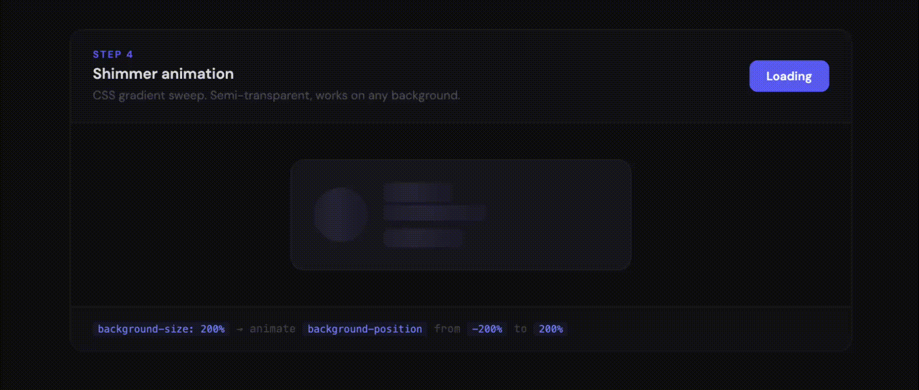
And we haven’t written a single line of skeleton layout code.
From static HTML to a real app
Everything so far has one assumption baked in: the data is already there. “John Doe” and “Software Engineer” are hardcoded right in the HTML.
In a real React app, that data comes from an API. During loading, it doesn’t exist yet. The component can’t render without it, and if it can’t, there’s nothing in the DOM to measure.
We need to solve two things:
- Give the component fake data so it renders its full structure during loading.
- Run the measurement before the browser paints, so the user never sees the invisible-text version, only the shimmer.
Step 5: Wire it up with useLayoutEffect
This is where it becomes a React component.
The idea: wrap <UserCard> in a <Shimmer> component that, when loading is true, clones the child with mock data, renders it invisibly, measures the DOM, and overlays shimmer blocks. When loading flips to false, the shimmer disappears, and the real component with real data takes over.
Two React APIs handle the injection of mock data.
React.Children.onlygrabs the single child element from whatever is wrapped in<Shimmer>.React.cloneElementcreates a copy of that child with extra props merged in, which is how we inject the mock data.
So <UserCard user={null} /> becomes <UserCard user={mockUser} /> during the measurement phase.
useLayoutEffect is the right hook for the measurement step. Unlike useEffect, it fires synchronously after the DOM updates but before the browser paints.
If we used useEffect instead, here’s what would happen:
React renders the mock component → browser paints it to the screen (brief flash of invisible text) → effect runs and measures the DOM → shimmer blocks get added → browser paints again.
The user would see a frame of the transparent-text component before the shimmer appears. useLayoutEffect prevents that intermediate paint entirely.
Let’s see how everything looks wired together. The ShimmerBlocks component from Step 2 is inlined as a .map() directly in the JSX:
function Shimmer({ loading, children, templateProps }) {
  const containerRef = useRef(null);
  const [measurements, setMeasurements] = useState([]);

  useLayoutEffect(() => {
    if (loading && containerRef.current) {
      const rects = measureLeafElements(containerRef.current);
      setMeasurements(rects);
    }
  }, [loading]);

  if (!loading) return children;

  // Clone child with templateProps for mock data
  const child = React.Children.only(children);
  const clone = templateProps
    ? React.cloneElement(child, templateProps)
    : child;

  return (
    <div ref={containerRef} style={{ position: 'relative' }}>
      <div style={{ color: 'transparent', pointerEvents: 'none' }}>
        {clone}
      </div>
      {measurements.map((rect, i) => (
        <div
          key={i}
          className="shimmer-block"
          style={{
            position: 'absolute',
            top: rect.top,
            left: rect.left,
            width: rect.width,
            height: rect.height,
            borderRadius: rect.borderRadius,
          }}
        />
      ))}
    </div>
  );
}
The templateProps part is important. Your real component expects data, a user object, a list of transactions, whatever. When it’s loading, that data doesn’t exist yet.
templateProps lets you pass mock data so the component can render its full structure for measurement. “John Doe” as a name, “Software Engineer” as a role. The text is invisible anyway; it just needs to take up roughly the right amount of space.
Why not just render a separate skeleton component?
Because with this approach, the same component handles both states with a single set of CSS rules and a single layout to maintain.
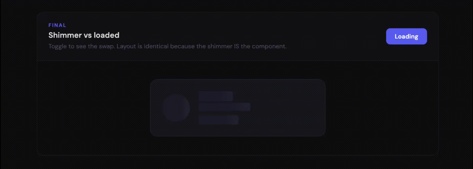
Here’s what using the finished component looks like from the outside:
const mockUser = { name: 'John Doe', role: 'Engineer', avatar: '/placeholder.jpg' };

function App() {
  const { data: user, isLoading } = useQuery(['user'], fetchUser);

  return (
    <Shimmer loading={isLoading} templateProps={{ user: mockUser }}>
      <UserCard user={user} />
    </Shimmer>
  );
}
Hurray! We did it! Check it out:
Step 6: Handle edge cases
The happy path works. But real components are messy, and a few things will bite you.
Block-level elements stretch to full width.
If you’re seeing full-width shimmer bars where you expected text-width ones, this is why. An <h1> inside a flex container takes the full width of its parent, not the width of its text content.
Adding width: fit-content on text elements in your CSS fixes this, but it’s not something the shimmer library should enforce.
It’s a decision for the component author.
Elements with display: none or zero dimensions should be skipped.
If an element isn’t visible, there’s nothing to shimmer. Some components conditionally render elements: an error message that appears only when validation fails, and a badge that shows only for premium users. With mock data, these might not render at all.
const rects = Array.from(elements)
  .map(el => {
    const rect = el.getBoundingClientRect();
    if (rect.width === 0 || rect.height === 0) return null;
    // ...measure as before
  })
  .filter(Boolean);
Images without explicit dimensions collapse.
If an <img> has no width/height attributes or CSS dimensions and the src hasn’t loaded, it’s 0x0.
This is probably the most common problem.
Your mock data should include a placeholder image, or better yet, give the image container explicit dimensions in CSS. This is good practice anyway for preventing layout shift.
SVG elements.
Only the outer <svg> gets measured. Internal paths and shapes are part of the SVG coordinate system, not the DOM layout, so getBoundingClientRect on a <path> gives you the bounding box within the SVG viewport, which is not useful coordinates for positioning a shimmer block.
If you have an icon SVG, the outer element is enough.
Async components.
If your component uses a library like Recharts that renders asynchronously with ResponsiveContainer, the DOM might not be fully laid out when useLayoutEffect fires.
The container might be there, but empty. This is the one situation where the measurement approach falls apart. The workaround is to specify explicit container dimensions, so there’s something to measure before the async child renders.
Window resize during loading.
The measurements are taken once, when loading flips to true. If the user resizes their browser while data is still loading, the shimmer blocks will be positioned based on the old layout.
For most loading states that last a second or two, this never comes up. If your loading states are long, you’d want to add a resize listener that re-triggers measurement.
Designing mock data
The mock data you pass through templateProps doesn’t need to be realistic; it just needs to take up roughly the same amount of space as the real data.
If a user’s name is typically 10-20 characters, “John Doe” is fine. If you use “J” as mock data, your name shimmer block will be too narrow. If you use “Alexander Bartholomew von Hochstein III”, it’ll be too wide.
Neither is catastrophic because the shimmer is a placeholder, but closer is better.
For lists, the length of the mock data array matters. If your component renders a list of five transactions, your mock data should also have five items. Three items mean three shimmer rows. The user expects five.
const transactionsTemplate = {
  transactions: Array(5).fill({
    id: 'mock',
    description: 'Loading transaction',
    amount: '$0.00',
    date: '2026-01-01',
  }),
};
This is the one piece of manual work you can’t avoid. Unless your API implements a Swagger with examples, you can use them directly.
The tradeoffs
Runtime measurement isn’t free.
Template-based skeletons render static elements. This approach renders the full component tree with mock data, measures it, then renders shimmer blocks on top.
For a card component, the difference is invisible. For a data table with 200 rows, you might want to reduce the mock data to a representative sample of 10 rows rather than the full dataset.
Your component also needs to render with mock data.
If it performs complex initialization in useEffect or makes API calls on mount, ensure it doesn’t occur during the measurement phase.
Components that receive data as props handle this naturally; the mock data is just another set of props. Components that fetch their own data need a guard.
And useLayoutEffect blocks the paint.
For a single card, the measurement takes a fraction of a millisecond. For a dashboard with twenty independently loading sections doing simultaneous DOM measurements, you’ll want to profile it.
I measured a page with twelve <Shimmer> wrappers on a mid-range laptop, and the total measurement time was under 2ms. Not zero, but well within a single frame budget.
But you never maintain a skeleton again. The component IS the skeleton. Touch the layout, and the shimmer updates automatically because it’s computed at runtime.
The library that implements this fully is shimmer-from-structure. It handles the edge cases above, plus configurable shimmer colors, animation duration, and a provider API for app-wide defaults.
Here are some happy skeletons:

References
- shimmer-from-structure — the library that implements this pattern
- react-loading-skeleton — template-based skeleton components for React
- react-content-loader — SVG-based skeleton loader
- MDN: getBoundingClientRect()
- MDN: getComputedStyle()
- React docs: useLayoutEffect
- Luke Wroblewski: Mobile Design Details: Avoid The Spinner — the original case for skeleton screens over spinners

Discover more from The Neciu Dan Newsletter
A weekly column on Tech & Education, startup building and occasional hot takes.
Over 1,000 subscribers


