· design patterns · 12 min read
Javascript Component Patterns to Scale up your Web Application
The Web has evolved. We are now building web applications that can handle millions of users per second. Here are the best component patterns to help you scale.
Neciu Dan
Hi there, it's Dan, a technical co-founder of an ed-tech startup, host of Señors at Scale - a podcast for Senior Engineers, Organizer of ReactJS Barcelona meetup, international speaker and Staff Software Engineer, I'm here to share insights on combining
technology and education to solve real problems.
I write about startup challenges, tech innovations, and the Frontend Development.
Subscribe to join me on this journey of transforming education through technology. Want to discuss
Tech, Frontend or Startup life? Let's connect.


Many people don’t realize this, but the biggest enemy of software engineering is change.
Changing your code over and over again opens the door for a myriad of bugs to sneak in. But this is the industry we live in, we have to build, deploy and measure very fast, and thinking at the beginning of all the possibilities your feature can take has the downside of slowing you down.
So how do you choose? Which features should be over-engineered from the start because they would have many changes, and which features are ok to go as fast as possible?
And after choosing, how do you build your components, in such a way they are resilient to bugs, follow SOLID Principles, are as extensible, and easy to test as you can make them?
In this article, we will talk about different component patterns, how to build them and when to use them.
If you prefer video format, I also talked about this subject Vue-Roadtrip Barcelona Conference, and you can watch the video here.
A common problem in middle to big-sized applications is the number of teams that are continuously modifying code. A solution for this is to give ownership to components at the team level.
But even then, you will still have teams with horizontal ownership, like teams working on Performance, SEO, or other cross-app features.
Let’s assume that we live in the perfect world, and you and you’re team has strict ownership of a business domain and all the components associated with that domain.
The next step is to break down all the features that you own and split them into three categories:
- Core Features
- Support Features = Generic Features
These categories will determine how you build your components. If your feature is a money-making feature for your app, a core functionality that makes your business stand out against your competitors then you can categorize it as a Core Feature.
Core Features tend to change, a lot, so you have to apply extra care when building and modifying the underline components to keep them readable and extensible.
If your Feature is more of a utility function, or something similar, then you can classify it as a Support Feature. This category rarely changes, once you build it and unit test it, odds are you will never touch it again—for example, the Base Modal in your app that extends all the other modals.
Generic Features on the hand, are features that every app has, like Authentication and Login, the Shopping Cart in an e-commerce application, etc. These features are in the middle of the might change spectrum.
So when we start a new feature or modify an existing one, take some time to categorize it and try to apply the component pattern that works better with it.
This way, you may save your future self and colleagues a lot of hassle in the future.
Container — Presentational Pattern
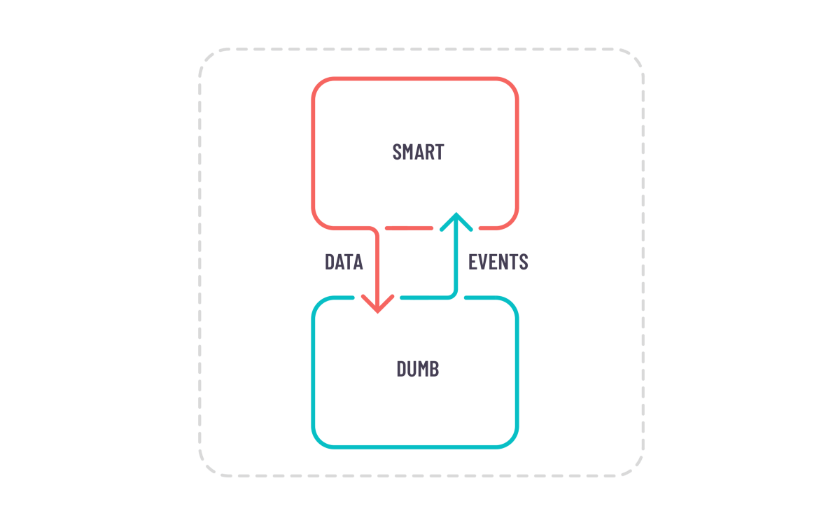
One of the most popular component patterns there is, and a lot of people are using it without knowing its name or its benefits. It was made popular by Dan Abramov in a blog post in 2015, since then he has repented and no longer promotes this pattern, especially in React Applications.
But I still believe it has its merits when you properly scope your feature in the correct context.
The basic idea is to split your feature into container components and presentational components — just like the title says.
Presentational components:
- Are responsible to present something on the screen
- They have no logic of their own, that’s why they are playfully called dumb
- They emit events when interacted upon.
- Are decoupled from the rest of the application logic
The last one means that you don’t use inside them, 3rd party libraries or redux libraries, they just receive data as props, make that data look pretty for the user, and emit events when users are interacting with the component.
Container Components on the other hand:
- Are responsible for getting the data that we pass to our Presentational Components
- They listen for events from the child components and handle the logic needed for those events
- They can have multiple presentational / container components as children.
- But they should have only one domain responsibility.
The reason for the last bullet point is it can get very easy to add more and more logic to a container component. Because that’s where the logic is supposed to be and that would transform our component into a God Object.
So keep your responsibilities clear, split your container component into multiple container components if needed and make sure your component is readable and testable.
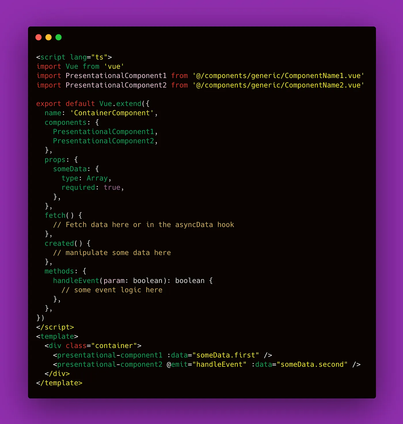
Here is an example of this pattern in practice:
Base — Variant Pattern

This pattern is pretty simple in theory and very useful in practice.
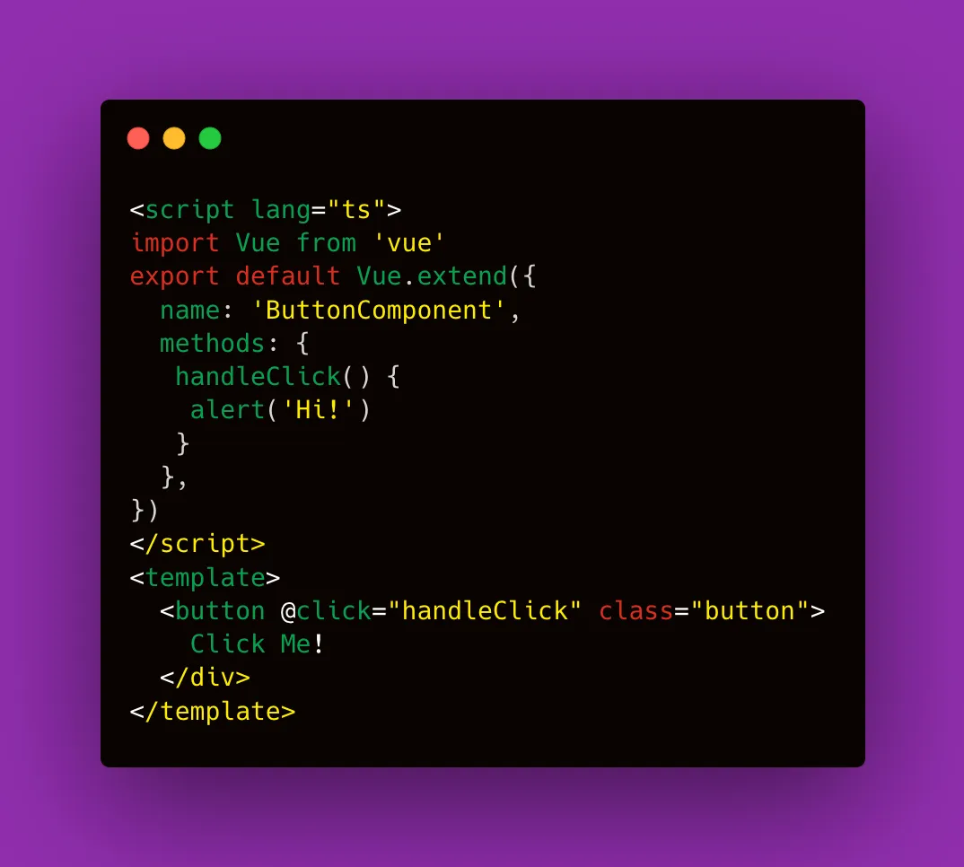
Imagine you have a ButtonComponent, a nice shiny red button, that triggers an alert when clicked.
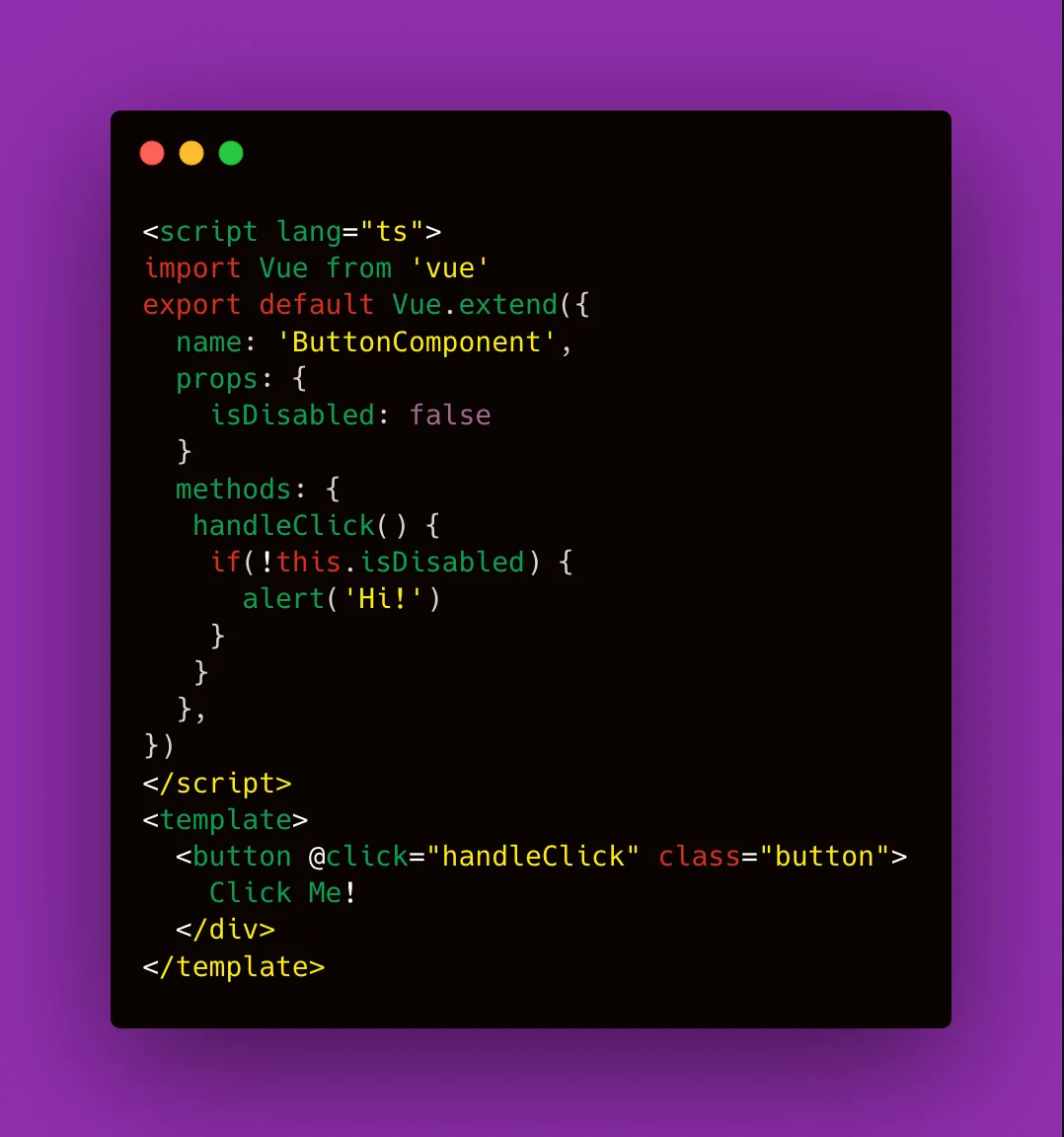
Now, you want to have a disabled state which means we want the background to be greyed out, and when the button is clicked nothing to happen.
Easily enough! We can just pass another prop with our disabled flag and modify the component to suit our new behavior.
Now, seeing these two amazing buttons, your PM wants another button that has an icon and when clicked opens an Information Modal.
Being the good developer you are, you grind your teeth and add another prop for this flag and change the logic and style to accommodate this new request.
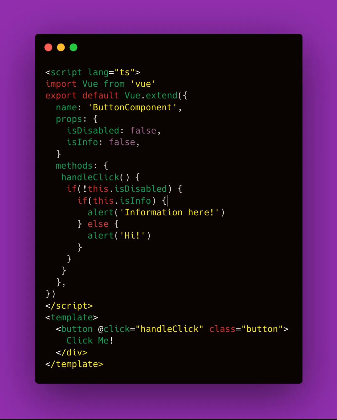
I think we can all see where this is going… there will always be another button, and another modification and our ButtonComponent will grow to such levels that it will be impossible to read what is happening inside.
This is often the case for Support features: Modals, Buttons, Dialogs, and other components typically found in a Design System.
The Base — Variant Pattern guides us to encapsulate all the core functionality of our component in a Base component and never touch it again.
Instead, every time there is a need for a new modification, we create a wrapper component around our BaseComponent with the new functionality and design. This is a very good example of the Open / Closed Principle in S.O.L.I.D.
Here is how our BaseButtonComponent will look, it has the HTML button semantics, it has the click event, and the base CSS styles.

Now, when our PM wants us to build our Disabled Button Feature. We create a new component DisabledButtonComponent, our first Variant, that wraps around BaseButton and has the desired functionality.
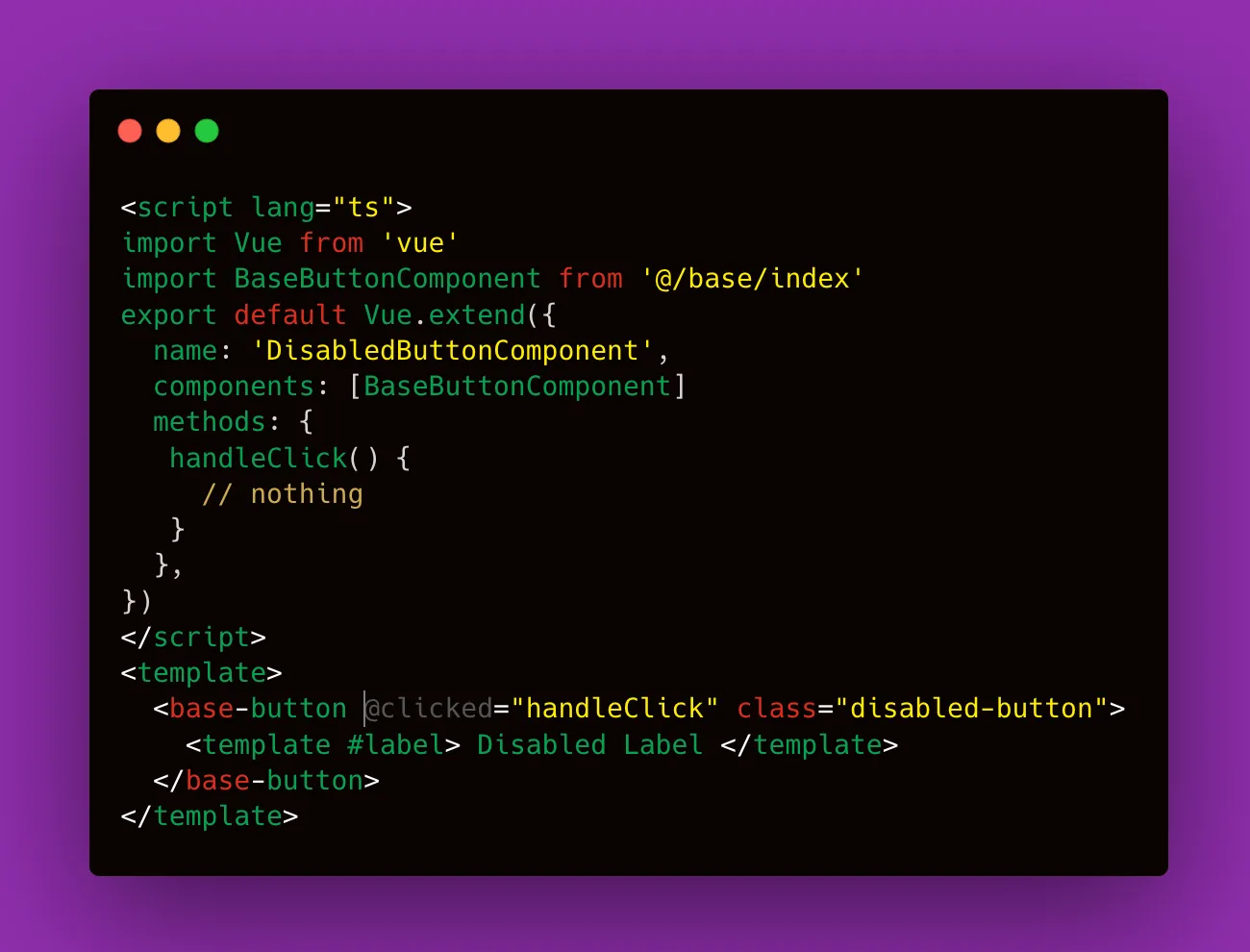
We proceed in the same fashion with the InfoButtonComponent and any other number of variants we want to build. The heart of what makes a button remains encapsulated in our BaseButtonComponent, and we don’t have to worry about changes to our core functionality.
One thing to mention, it’s important for your codebase, to never use the BaseButton directly in your files. That way you completely isolate the core functionality from the implementation details.
In our entire project we want only variants, the original is safe and sound, never to be touched again.
The Factory Pattern

The Factory pattern is a creational pattern that uses factory methods to deal with the problem of creating components without having to specify the exact component that will be created.
Sounds complicated, right?
The use-case for this pattern is when you want to render multiple components, but you don’t know what components exactly. So you delegate that purpose to a factory.
The factory component takes an array of data and based on a type property it renders the corresponding component with the needed data as props.
One way to use this pattern is in a Server Driven UI architecture. Made popular by Airbnb, this design pattern is very useful when you have one API for multiple clients. For example one web application and two mobile apps (iOS and Android).
It’s very expensive and it takes a lot of time to deploy something to the store apps. For example, you have to wait for the review of the respective stores which usually takes 2–3 days, and all you wanted to do was move one button from the left side to the right.
Server Driven UI gives that responsibility to the API, which sends a big response that basically paints the content in the app. It usually is an array of elements and each element has a type + the data necessary for that element.
Here is an example of a response:
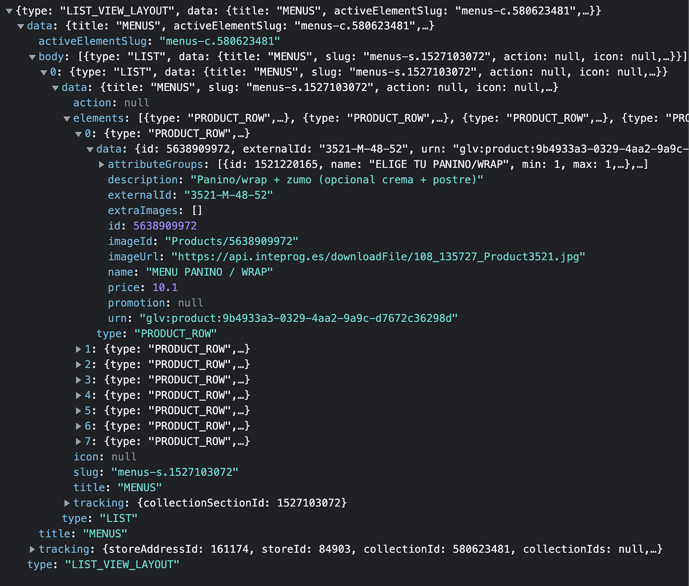
Now the job of the frontend is to iterate through the elements and create the corresponding component. The component itself was in the codebase from the start, if the element type is something we don’t have in our factory Enumarables we should default to a basic component.
While this pattern is extremely useful and clean and has the immense advantage to bring consistency across all your platforms, it also has some big disadvantages.
The skeleton for this takes a long time to build, especially the backend. You also need to already have a pretty good component library in your application that shares the same Design System with your apps.
Another big con is how hard it is to implement tracking for all your user actions. Because rendering the content is only half the battle. For every user interaction (button, link, input), we have to make the request to the API again and ask: How should the content look now?
As you can imagine this is not ideal when you care about performance.
We found that the perfect utility for this pattern is when rendering a list of components that their main action keeps the same design or takes you to another page. For example banners, products in an e-commerce listing, etc.
If your feature is a core business domain, this pattern could be useful, because once implemented it is very easy to change.
Composable Components Pattern

From my experience, this pattern gives you the most flexibility when implementing features that have a high degree of change.
The goal of this pattern is to break your feature into atoms. Some are purely logic components and some are just presentational.
Technically it is a combination of the previous patterns, plus a little extra in the form of data providers. But we’re getting ahead of ourselves, let’s start with the basics.
First, you have to split your components into three types:
- Layout Components (responsible of the layout of the feature)
- Composables (responsible with the logic of the feature)
- Renderless Components. (responsible with mixing and matching the other two types of componenets)
Let’s go through each of them.
Layout Components
Going back to the container/presentation pattern, imagine you are building your feature, but you don’t know if you have the best design + functionality for your users.
Some users prefer a more minimalistic design with fewer features, while others need more information and a design that captures their attention.
Let’s build an imaginary feature.
Think of an input that adds your address in your favorite food delivery app. You have a button that opens a modal with a map and you can select your location. You also have a text input where you can write your address.
We want to A/B test variations of this input, design-wise but also logic-wise. In one variation we want the input with the location button and in another with more text and without this button.
Here are some screenshots of what we want:
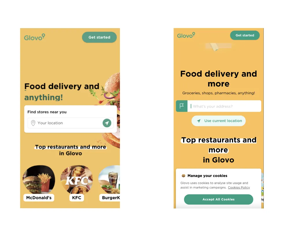
Now, you might think the best solution is just to create two separate container components using the same presentational component. And in theory, we are doing just that, but we also want to separate the design part from the logic.
Because tomorrow, a new design may want to be implemented for our feature, and we don’t want to have multiple containers with the same logic inside. DRY = Don’t Repeat Yourself is our motto.
Composables / Hooks
Here is where the logic resides. Instead of having logic and layout in the same Container component, we split them into different types of components.
For each feature logic we have, we create composables or hooks in the React world.
These are pieces of logic, encapsulated, and reusable that do not return any HTML.
Keeping with our Address Input Feature, we identify 3 distinct logical components:
- The logic where we get the user’s current location based on the Browser location data.
- The logic where we open the Location Modal once the user taps the button
- The logic to render the input, if the user already has an address or not.
- The logic of deciding when the input becomes sticky in the header.
We extract each of them into their own composable. For example:
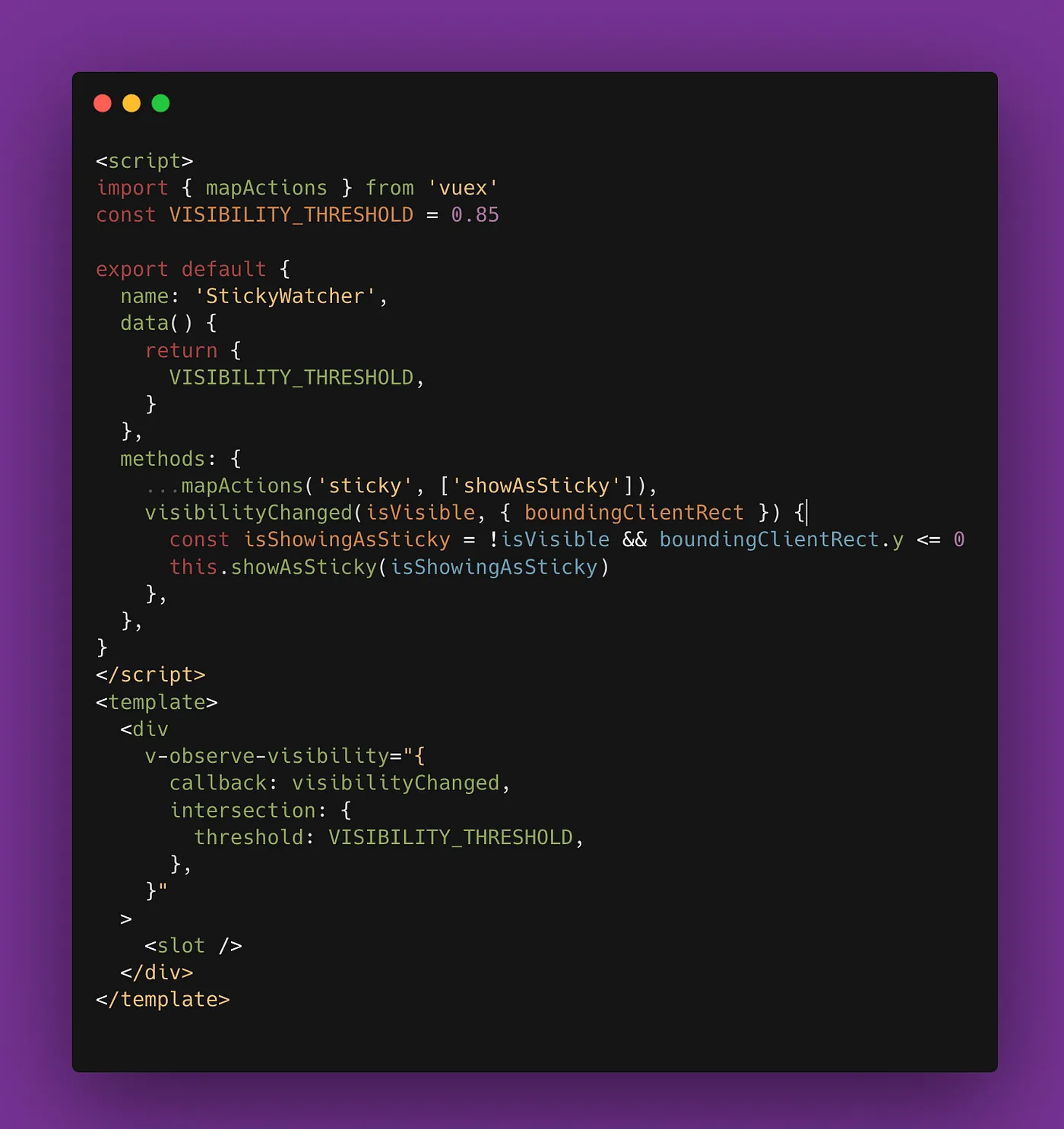
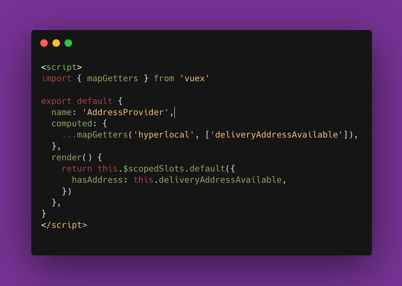
Another example of a composable, is data providers. Maybe inside your feature you need access to some piece of data, either from a redux store or from another part of the application.
To not pollute our feature component with props that some part of the feature might not use or pass props around from child to parent, we create a ProviderComponent that gets the data and pass it along to the interested component.
Here is an example of a data provider:
Renderless Container Components
It’s important to think of Composables and Layout components as our lego bricks. And it’s time to put everything together.
Using Renderless Container Components, we can mix and match as many layouts with the necessary logic, and provide information using data providers.
The end result is a feature that is split into tiny atomic particles that can be mixed and matched as much as possible.
Even better, if you need in the future to change your component, you do not modify the original. You just create a new variant, using either another layout, or adding another composable and so on…
There are downsides of course….
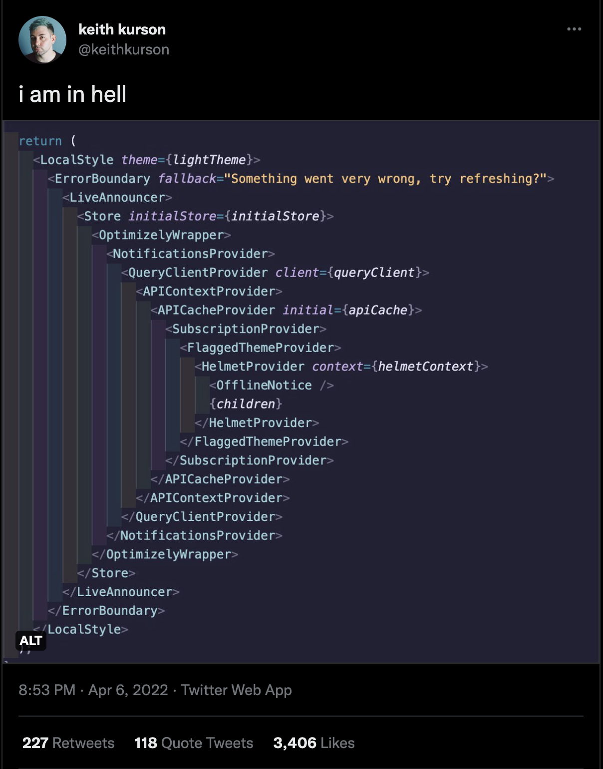
You would most certainly end up with something like this. The end result is not pretty but it is sure as hell very powerful.
When building a core business feature, take this pattern into account. It could save you a lot of time and resources.

Discover more from The Neciu Dan Newsletter
A weekly column on Tech & Education, startup building and occasional hot takes.
Over 1,000 subscribers


