· css · 9 min read
CSS: The !Important Parts
Struggling with CSS is a common practice, here we explain how it works and common problems that can appear in your code.

Neciu Dan
Hi there, it's Dan, a technical co-founder of an ed-tech startup, host of Señors at Scale - a podcast for Senior Engineers, Organizer of ReactJS Barcelona meetup, international speaker and Staff Software Engineer, I'm here to share insights on combining
technology and education to solve real problems.
I write about startup challenges, tech innovations, and the Frontend Development.
Subscribe to join me on this journey of transforming education through technology. Want to discuss
Tech, Frontend or Startup life? Let's connect.
CSS (Cascading Style Sheets) is a language used for describing the presentational layout of a document. More specifically it is used together with HTML to create beautiful and user-friendly websites or apps.
But since the first version of CSS came out in 1996, the language has evolved into a tool used to create really awesome things. Like the entire cast of The Simpsons using just CSS or a CSS-only Game Boy or a pretty cool starry night and so much more.
Pretty amazing, right?
In this article, we will highlight how CSS works under the hood, what are the rules CSS uses to evaluate blocks of code, and some tips and tricks that can help you reach the next level in your journey to CSS Mastery.
How Does CSS actually work?
When you start writing HTML, without adding CSS, the browser will render your elements in normal layout flow. Even after adding some CSS to your elements, if you do not change the display or position property, they will still be rendered in the normal flow.
What does that even mean?
The layout model dictates how your element behaves by default, and what CSS properties your element has access to.
Here are the available layout models:
- Normal Flow
- Positioned Layout (absolute, block)
- Flex
- Grid
- Table
Have you not noticed that z-index does not work if you do not apply the position property to your element? Well, this is the reason. The property is not available in the normal flow, or in some of the other layouts as well.
Adding position:absolute will switch your element from the normal layout module to the positioned one. In this layout model you have access to extra properties, like z-index.
z-index for example, determines the layout order of elements. If you have two elements in the same position and you want to stack them, the one with the higher z-index value will be on the top.
If you want to send an element to the bottom of the stack, just set it’s z-index value to a negative number.
A very important detail to remember is that z-index is only useful in the same stacking context.
A stacking context is the collection of child elements inside a parent element. So for example, if we have .parent1 { z-index: 1; } and inside we have .child1 { z-index: 999; } the child element will not be stacked against other elements outside of the parent.
Here is a concrete example to see this in action:
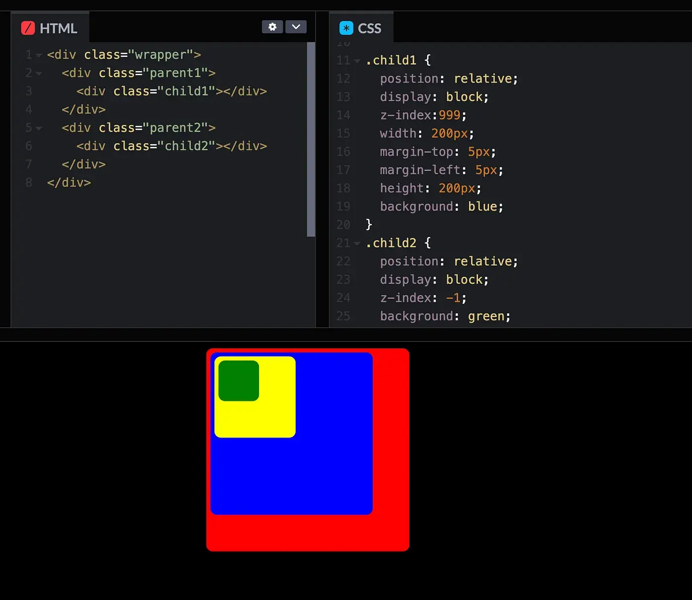
As you can see above, it does not matter that child1 has z-index:999 and child2 has z-index:-1 because we compare their stacking context.
So each layout model has its own properties and rules. And it shares some common ones as well. For example, both flex and grid contain the gap property to set the spacing between the items.
From this, it’s only a matter of figuring out what properties are implemented in which layout model, and then you will have fewer problems with CSS behaving differently from one context to another.
Specificity. Rules are made to be followed
It took me a while to understand how specificity worked in CSS. It seemed unimportant (ironically) because everything just worked.
So what if sometimes I had to add a few !important here and there. Or move some code blocks lower in the CSS file to make sure they are applied last. Or worst-case scenario, duplicate some code for different classes. In the end, it worked and that was what mattered at the time.
I realized how wasteful I was when I had to write optimized code for web applications visited by millions of users. And how hard to debug my code actually was, and little by little I started to understand the rules the Browser Gods act upon us mortals.
So what is specificity and how does CSS work? Here is the definition from Mozilla Developer Network:
Specificity is the means by which a browser decides which CSS property values are the most relevant to an element and therefore will be applied. Specificity is only based on the matching rules which are composed of CSS selectors of different sorts.
Basically, the Browser looks at your CSS rule and gives it a score. Actually 4 scores.
Four numbers separated by a comma 0, 0, 0, 0
Then when you have two colliding CSS rules it goes through the first digit and compares them if there is no clear winner it goes to the second digit and so on.
If all columns are equal, the browser will pick the rule based on the order. Here is where the Cascade name comes into place. It takes the one closer to the bottom.
Here is the breakdown of the four digits:
The first digit represents if the element has inline styles.
<p style="color:red">Hello World</p>The second digit represents the number of #ids in your CSS rule.
<p id="myParagraph">Hello World</p>or
#myParagraph {
  color: blue;
}
The third digit is the number of classes, pseudo-classes, and attributes your CSS rule has.
<style>
.myParagraphClass {
  color: green;
}
</style>
And lastly, we have the number of elements and pseudo-elements.
<p>Hello World</p>
<style>
p {
  color: yellow;
}
</style>
So for each rule in each column, we increase the score of that column.
Now you may have read that inline-styles give you a score of 1000, ids of 100, and so forth. This is not true.
For example. Let’s say we have an element with 102 classes and just one ID. Like the following code:
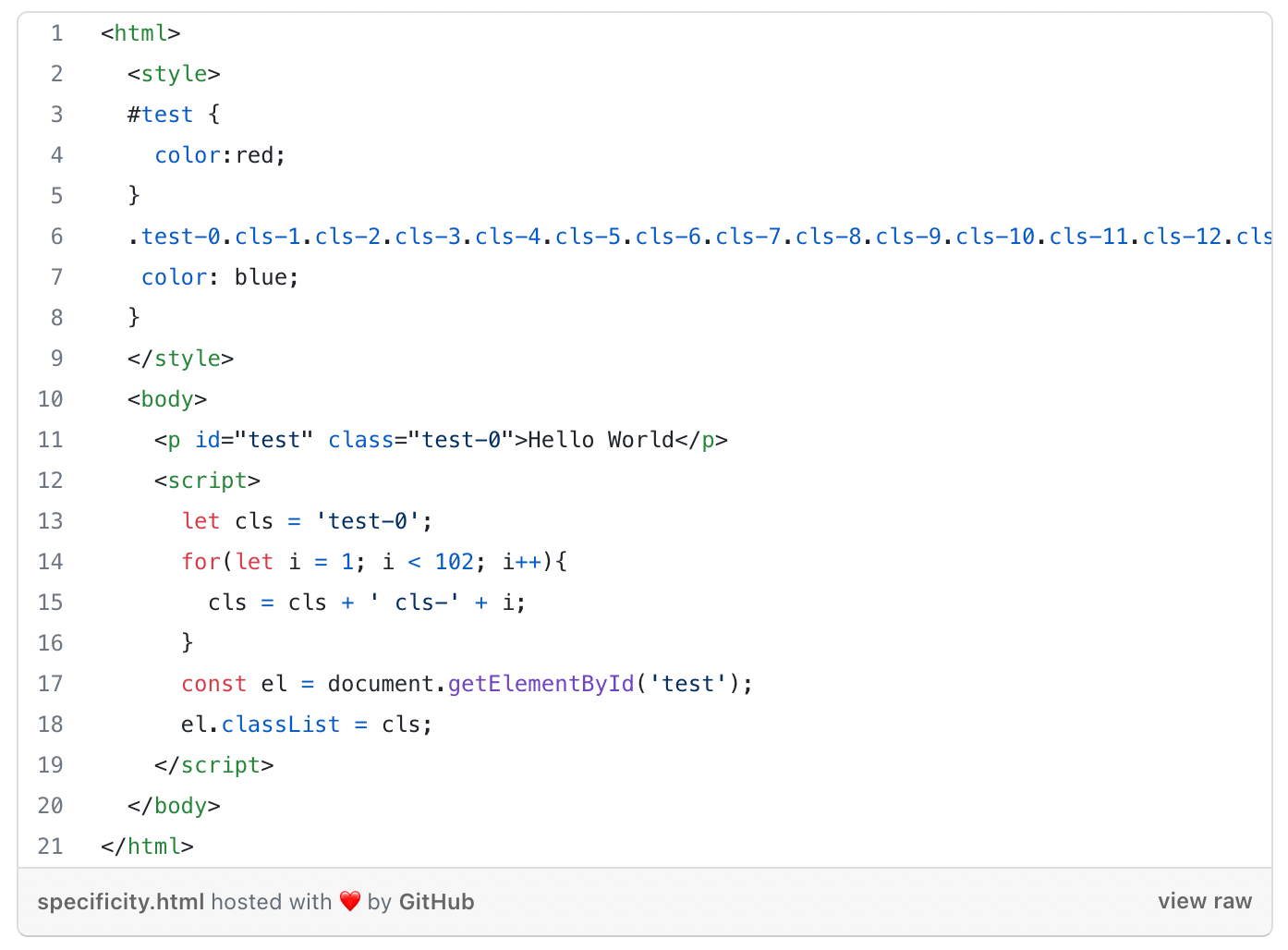
If you would follow the rule recommended by some articles and w3school, the ID should have a score of 100, and the class should have a score of 103 resulting in a blue Hello World text. But if you check this in your browser it’s actually red.
Browsers do not compare apples with oranges. The browser first checks if we have conflicting rules at the inline-style level and applies the score there, then goes to IDs and so on and so forth.
Another example would be:
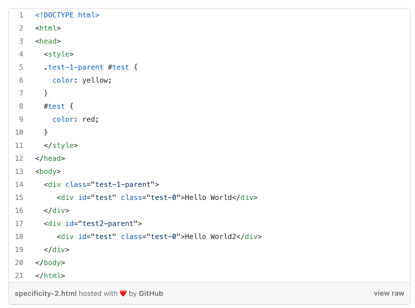
The #test { color: red; } has a specificity score of 0,1,0,0. While the second CSS rule .test-1-parent #test { color: yellow; } has a specificity score of 0,1,1,0. The first column is equal, so the Browser moves to the second column where both have a value of 1.
Then we move to the third column where color:yellow is the winner.
Collapsing Margins
“In CSS, the adjoining margins of two or more boxes (which might or might not be siblings) can combine to form a single margin. Margins that combine this way are said to collapse, and the resulting combined margin is called a collapsed margin.“ — W3C
I am ashamed to admit this, but in my second to the third year as a professional developer, I did not know about collapsing margins. Even worse than that, in my ignorance, I would argue with designers that complained that the spacing between elements was off.
I would open the DevTools and show them, margin-top:50px see? And they would nod, in that I-see-it-but-I-don’t-believe-it way.
For this, I want to formally apologize to all designers that I did this to or to all designers that suffer from this because of ignorant developers like me.
Hopefully, I can make amends with this article and educate other poor ignorant frontend developers and you will never have to go through this again.
As you can imagine, collapsing margins, are the reason even though we had margin-top:50px; on the element the margin could be different. And here is why.
When two vertical margins (top and bottom) interact with one another, CSS has a weird rule, it makes them duke it out and the bigger one wins.
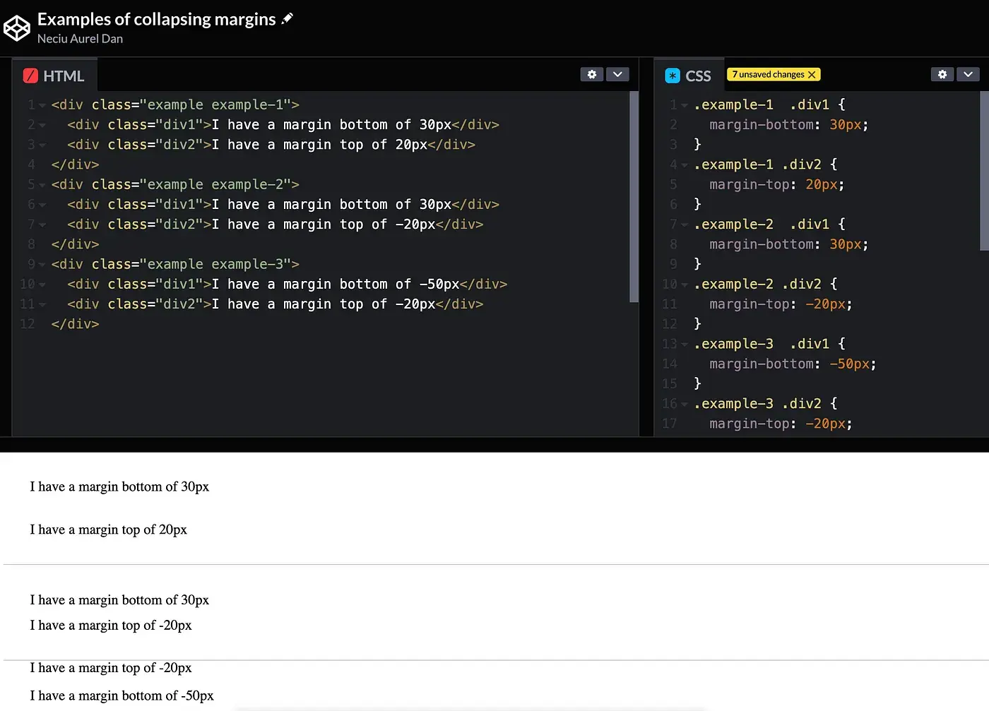
For example two HTML elements on the same level in the DOM, .div1 { margin-bottom: 30px; } and .div2 { margin-top: 20px; } , you would expect the distance to be the sum of the margins. But in fact, the collapsing margin rule comes into effect, and we only have 30px (the bigger margin from .div1) between them.
On the other hand, if one of the elements has a negative margin, .div2 { margin-top: -20px; } then it behaves as you expect. And the margin between them is the sum of 10px.
More mind-blowing though is when both elements have negative margins. For example, .div1 { margin-bottom: -50px; } and .div2 { margin-top: -20px; } you would expect again, either the sum or the biggest in mathematical terms to be the result, as we know -20 is bigger than -50 because it’s closer to zero, but NO who invented CSS said no to proper maths and the margin between them is -50px. Amazing!
Here is a Codepen to simulate all examples:
One more thing to take into consideration is the parent-child relationship between elements where again collapsing margins can cause trouble.
If the parent element has a margin, let’s say .parent { margin-top: 50px; } and the first child of this element also has a margin .child-1 { margin-top: 20px; } the margins will collapse again and we will only see the bigger one.
 So that’s how collapsin
g margins work. Now you may be wondering how to stop it. Easily enough, if you apply anything between the margins, like a border-top or a padding-top then the margins will not touch each other and will not collapse at all.
So that’s how collapsin
g margins work. Now you may be wondering how to stop it. Easily enough, if you apply anything between the margins, like a border-top or a padding-top then the margins will not touch each other and will not collapse at all.
Think about this physical barrier as the referee that keeps two boxers at bay from fighting each other when the round ends.
In Conclusion
CSS is hard! It has all sorts of wacky behavior. But if you know on which layout model you are, you have a better chance of figuring it out.
Specificity rules are there to decide between conflicting CSS properties. Remember the 4 levels and how to count the score.
And if margins are giving you a problem, remember that the physical barrier between your elements will keep them from fighting each other
You know what they say, a border-top: 1px solid transparent, keep the collapsing margins away.

Discover more from The Neciu Dan Newsletter
A weekly column on Tech & Education, startup building and occasional hot takes.
Over 1,000 subscribers


